Plynth Homes

Corporate Design
Logos, Typography, Style Guide, Print Design, Flyers, Business Suite
Role
Graphic Designer
Software Used
Photoshop, Illustrator, & InDesign
Year
I took the opportunity to go to new development homes and explore each home while taking pictures of anything with a Real Estate logo. For instance, rugs, mugs, or items such as hard hats. Plynth Homes represents sustainability and healthy living. The diagonal line represents the roof of a home while the brown lines represent the house. I wanted a cool to warm color logo that shows the coziness and comfiness of the living space. I chose blue for security because you want to feel safe and secure in your home and I chose brown because of structure and because you want your home to be ordered and organized.
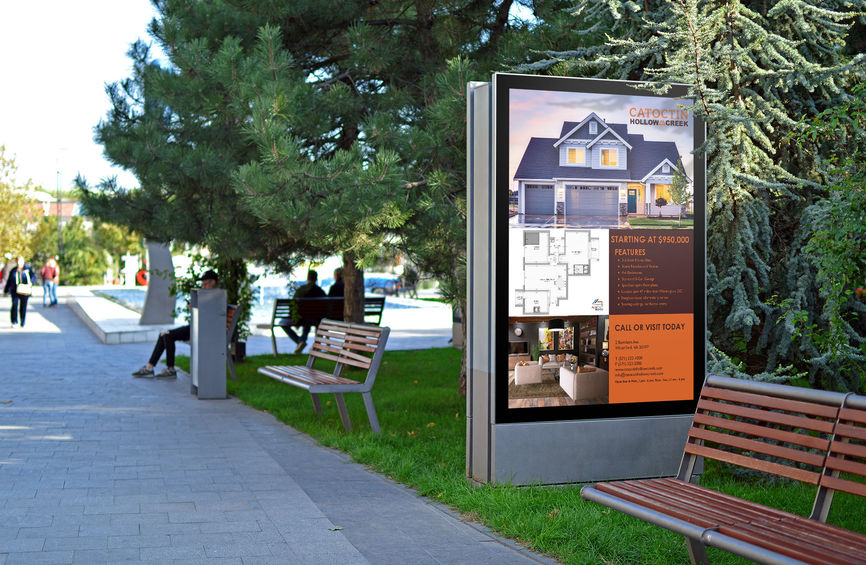
I created a front and back development marketing sheet that consists of a home, amenities, floor plan, site map, and area map. I added a minimalistic logo to give the marketing sheet a more simplistic feel. The floor plan was created on Easyhome Homestyler which is a free website where you can design a floor plan or build a home. The area map and sitemap were both created in Illustrator. I designed a simple logo for Catoctin Hollow Creek and chose the colors orange and maroon to represent strength and motivation.
June 2018 - July 2018


